Howdy, Stranger!
It looks like you're new here. If you want to get involved, click one of these buttons!
Quick Links
Categories
- 7.8K All Categories
- 11 Help with translations
- 4.2K General questions
- 107 Roadmap
- 358 Game & application design
- 316 Plugins
- 70 User experience
- 75 Marketplace
- 291 Code snippets
- 34 Building a team?
- 269 Suggestions & requests
- 352 Announce your apps made with Gideros.
- 90 Step by step tutorials
- 668 Bugs and issues
- 195 Introduce yourself
- 239 Announcements
- 106 Forum talk
- 404 Relax cafe
In this Discussion
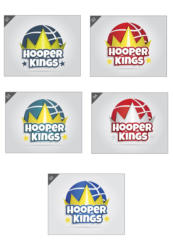
Help us to choose suitable color of our game logo!
 mefisto
Member
Our first game project is a basketball game. Our friends have different opinions about color of game logo. So i decided to ask gideros community for help, just provide a number of logo. All comments are also wellcome 


Tagged:


Comments
Author of Learn Lua for iOS Game Development from Apress ( http://www.apress.com/9781430246626 )
Cool Vizify Profile at https://www.vizify.com/oz-apps
#MakeABetterGame! "Never give up, Never NEVER give up!" - Winston Churchill
@OZApps of course using basketball's actual colour is more meaningful but on the other hand using different colour may be more distinguishing.
Website: http://www.castlegateinteractive.com
https://play.google.com/store/apps/developer?id=Castlegate+Interactive
#MakeABetterGame! "Never give up, Never NEVER give up!" - Winston Churchill
By the way just for information:
I showed your logo to 3 of my collegues without saying nothing to them. (I did'nt say it is a game or company etc..)
Here is the comments,
1-Burger king commercial.
2-Game logo. (I asked how he understands, he said that he saw the basketball there:)
3-Game logo. (from ball and the word hooper)
So statistic for logo success in my tests are 3/2
Likes: atilim
@Scouser yes
@talis special thanks for your research
Ultimate Games on Appstore
Ultimate Games on Google Play
But I prefer #05.
in that order! looking forward to seeing the game
The crown and the stars on the side (especially number 02) would represent the noise made by the shutting?
Don't hesitate to tell me if I really need more sleep
@mefisto how does your favorite icon stand out in the middle of the competitors that appear under the same keyword in the app stores?
Have you made a mockup to visualize it?
Looking at the icons on this page I think #5 stands out because the colors on this one are more saturated. But that doesn't mean its efficiency is the same when compared to your competitors.
Likes: talis
Website: http://www.castlegateinteractive.com
https://play.google.com/store/apps/developer?id=Castlegate+Interactive
Author of Learn Lua for iOS Game Development from Apress ( http://www.apress.com/9781430246626 )
Cool Vizify Profile at https://www.vizify.com/oz-apps
I don't remember anymore. But somewhere people tested people's attraction to colors. The've made two buttons - red and (light/soft) blue. The blue button got the most klicks. So I would suggest you to take the number 03, because it catches my attention the most.
But looking at other votes, maybe I'm reversed polarity
»Gideros Illustrator« - [svg|xml] scene designer using Adobe Illustrator®™ Within one line of code!